Monday 19 March 2012

Evaluation 2

How effective is the combination of your main product and ancillary texts?

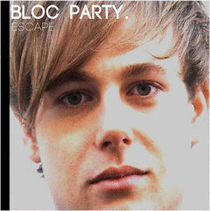
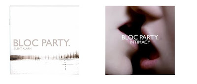
For our media coursework we had to make a music video and complete and ancillary task which involved the creation of album artwork and a magazine advert. Conventions across all the media platforms (music video, magazine advert and album artwork) will contain similar images, colour schemes, fonts and mise en scene (eg. clothing) to create an easily identifiable brand. An identifiable brand is important when promoting effectively. The brand needs to be recognizable for audiences so they can link the platforms together. Researching into these conventions allowed us to collaborate the same techniques into our media platforms. The genre of music that we decided on was Indie, so the first thing we did was to find songs of the indie genre. After numerous you tube videos and feedback from songs we decided on 'Flux' by Bloc Party. This band belong to the indie genre and so this was a helpful starting point in creating our media platforms.

Here is a short animated video about our target audience as previously shown in older posts.


Here I have layed out one of our ancillary tasks to show the connections between the three media platforms. As you can see there is a coherent house style throughout using the same colour schemes, fonts and images which are illustrated on all three platforms. We have taken screen grabs from our chorus and made them smaller for our poster. Using the same image we placed this onto our album as the front cover. This immediately created a link between the three platforms as we took the image from our video, placed it onto the advert and also as the front cover of the album. This would make all three platforms easily recognizable to our audiences. For our album work all panels included the dark colour scheme and the font 'code light' and 'code bold' this again created the same mode of address for our audience. Not only is this used throughout our media platforms but the same font is used on every Bloc Party album and so we tried to get a font that matched as closely as possible to keep our album realistic.On our poster we added a banner in order to promote the album.


This is our other digipak that we created first of all. The links between this digipak are not as strong as the one above mainly because of the differences between the magazine advert and album artwork. The images seen on our album are taken from our music video and is the first visual that the audience will see when watching it. We thought it would be a good idea to place eyes open on the front of the album and eyes closed on the back of the album in order to amplify the image and create structure. The inside of the album is created in a similar way, we have the same CD design but in a lighter colour and also the three images for the inside page have also been used to create the same house style. For the magazine advert in order to link the platforms together we added an image of this album so that audiences would link to two together. Artists such as Rhianna have done this to promote there album and we think it is an effective way of advertising the album and promoting the artist.

I believe that our ancillary task links in extremely well with our music platform. The use of similar colours and pictures means that the media platforms can be easily identified together. This is important when selling CD's as audiences know which promotional tools link with which product. We created two digipak's and even though there were two different colour schemes we still did link all the platforms together for example with the advert we placed an image of the CD cover on it so that audiences would recognize what the CD looked like.


Here is a questionnaire we conducted that asked nine people if they thought our three media products all linked together. As you can see the majority of the people we asked (6) said that it did link together and the other three said 'kind of'. This was positive feedback as no one disagreed that it did not. 


What would we change?
If given the chance to create the media platforms again we would change a number of things...
The video - For our music video we would have planned much more in advance; none of us had filmed or edited before and it was very time consuming. If we did not plan what we were doing we could miss bits out meaning we had to go out and re film again, time that could of been used to edit our video. If filming again I would plan our story line better as although it fit into the song we changed it from our orignal story board and so this one was not in as much depth. When going out to film I would plan what needed to be filmed in detail so that we did not waste time and we got all the footage that we needed. The colouring of the video was quite bleached; even though we changed it slightly in photoshop we would look to be more aware of lighting in the future.


The poster - I really like what we did with the poster and so I would not change much about it. If i could change anything I would have changed some of the smaller pictures we used as some were quite close up and stood out more than others. I really liked how it was layed out and had a real indie feel to it. Although we had two albums we did make the poster apply to both album covers.
The album artwork - We were quite limited on what images we could use for this as we wanted to take images from our video in order for the platforms to all link together, however there were not many shots of Jake on his own. If we could change this then we would take more pictures of Jake in the locations we had filmed in. This way we would have a nice image and also would have the location in the background so it was recognisable to the audience. Making two albums was time consuming and so if we did this again we could focus more on one album.

Tuesday 13 March 2012

Evaluation 1

In what ways does your media product use, develop or challenge forms and conventions of real media products?


Editing - Editing in an indie video is often fast paced, with a large number of shots in a short time. Often a fade in and out is used to start and finish the video. In our music video we have a variety of shots and our editing matches the fast tempo of the song. Some editing is faster than other in our video due to the different level of tempo's found within the song. This can be seen when there are single shots of Emily and Jake and the pace of editing is increased as the tempo speeds up.
Lighting - Often disco or stage lighting is used in Indie videos along with low key lighting. Some of our video has quite ambient lighting however this was due to the lighting at the time of filming. The camera we were using did not pick up images well in the dark and so in order to have clear lip syncing we needed to film during the day. We were able to use strobe lighting for our chorus which matched the beat of the song very well.
Camera -Usually band members will look into the camera in order to identify the individiual or lead vocalist. The majority of shots used are usually on steadicam or handheld. Our artist (Jake) is filmed in every scene with a number of extreme close ups, medium shots and long shots. This enables the audience to clearly identify and recognise the artist. Using medium shots enabled us to lip sync whilst also showing the body language of our character. All are footage was filmed on a tripod to enable steady and professional shots.

It is important that we look back at Andrew Goodwin's 'dancing in the distraction factory'. He mentions several important things that are vital for a music video to be successful.


1) Music videos will demonstrate genre characteristics - for example indie videos often show the artist or band as a performance and narrative which is what we have done in our music video.


2) Relationship between the visuals and the lyrics and the music and visuals -These either illustrate, amplify or condradic each other. In our music video we have used overlays to amplify and illustrate our lyrics for example 'if your right hand is causing you pain cut it off' we have included an overlay of him cutting his arm.


3) Record labels will demand lots of close ups of the artist - This helps to promote the artist and make them easily identifiable by audiences. In our music video we have used a variety of camera shots in order to create this.


Demonstrate the iconography and genre characteristic within the genre

shot 1)


In our music video we decided to introduce the use of overlays to show our techincal ability when editing. We researched a variety of music videos such as Pixie Lott 'all about tonight' who uses a variety of overlays in her music video to portray 'going out' which is part of the lyrics from this video. The use of overlays enables the audience to see two images at once which often helps to set the scene for a music video. In our video we used over lays to illustrate and amplify the lyrics, this meant that the audience visuals were enhanced and the lyrics matched what they were seeing.

Shot 2)

The use of extreme close ups helps to identify characters and shows all features. This makes them easily identifiable and distinguishes who is the main artist in the video. Extreme close ups also enable the artist to portray emotion through features such as the eyes, it creates a connection with the audience who can sense the emotion being created through the song. Many music video will feature at some stage close up camera shots of the main artist. As Andrew Goodwin stated 'every record company demands for lots of close ups' this allows the artist to be promoted and will help to generate record sales. An example of this can be shown in The Killers video 'Mr Brightside' where they use a number of close up shots of the main artist.

shot 3)
Strobe lighting is often use in Indie music videos to portay party scenes. Bloc party have often used strobe lighting when performing the song 'Flux' on stage live. To show the iconography and conventions of an Indie music video we decided to use strobe lighting for our chorus as it was up beat and we needed lighting to match the fast tempo of the song.


shot 4)
The use of two people in our music video helps to set the scene of 'boyfriend and girlfriend' a two person shot can help to show the emotion between two people and make it clear for the audience what is going on. This is apparenrt in most music videos to help create the narrative. In Example's video 'Kickstarts' a similar story line is portrayed showing the same camera angle as we did in order to fit both characters into the shot. This is a key convention of music videos that invole a boyfriend girlfriend scenario.

shot 5&6)
Lip syncing is a key convention of music videos. It helps to create a link between the artist and the audience. When lip syncing is in time it creates realism for the audience who are watching anfd they are able to identify the artist in the video. In almost every music video you see it will include lip syncing as it helps to promote the song. As well as this I have also chosen angles as a shot from our music video. At the beginning of the song we used a number of shots and edited them to fit the beat of the song. This can also been seen in depicts video 'doubt'.


shot 7)
The split screen enables you to show two different shots at once in different places. We used a split screen of Emily and Jake when they say 'we need to talk' almost as if they are saying it to each other but are in different places creating a sense of spatial awareness. Using a split screen helped to illustarate the skills we had learnt in final cut whilst editing our music video. I have used a similar image from Examples video 'kickstarts' which shows the use of a split screen. It shows a similar image but two different people just like we used in our music video.
shot 9)


The type of clothing worn in a music video is important in respresenting the genre of the band and also for creating a brand image that audiences can copy. For example Lady Gaga uses extreme clothing designs in all of her videos and also wears this type of clothing to big events, her fans can immedialtey recognise lady gaga just from her clothing. It is typical of the indie genre to wear skinny jeans and hooded tops, we used this mis-en-scene to emphazise our indie genre. As Andrew Goodwin says that music videos must "demonstate the iconography and genre characteristics within the genre" which is where the mis-en-scene of clothing fits in.

shot 9)

In every music video shown on television, a logo of that channel and name of the band and song is shown somewhere on the screen. It is important for audiences to identify the channel they are watching as it will distinguish the type of music that is being played for exameple 'scuzz' plays rock music and 'the box' plays up to date pop songs. For our music video we used MTV Music, research found that MTV Music had various information on Bloc Party and included them under artists name showing that they do play Bloc Party on their music channel. It is important to fit the song with the right channel to attract the right target audience, people watching certain channels will be interested in a certain type of genre and so are likely to like the songs if they are matched to the correct channel. The band name and song is a generic convention used by all music videos to allow the audience watching to know who sings it and what the song is called, this enables them to go and download the song on sites such as Itunes.
ancillary task
As well as using the conventions of ratings on a magazine advert it is also apparent that all adverts include pictures of the artist; this enables the audience to identify who the band or individual is. Magazine adverts are often made in the style of the bands genre for example Plan B's style is quite old fashioned and the lead singers voice has a 60's feels to it. This is relfected in the magazine advert which is seen in black and white with an old style microphone. Smiliarly Noah and the Whales portay an indie genre in their magazine advert. The colouring of the advert is quite pale and they are pictured in a field with a SLR camera. SLR cameras are asosiated with the indie genre as it is a way of expressing themselves through pictures of scenery and people.
band name and album Audiences need to identify who the advert is promoted and so it is a key convetion to place the artist name and album onto the advert. Music adverts often have the same type face as they have used throughout their time of being an artist and it helps to create the same mode of address. It creates a recognisable brand for the artist which is important especially when CD's are on the shelves in stores with hundreds of other choices.

promoting the album
animated gif maker
Promoting the ablum on the magazine advert is important because that is what the advert is there to do. Audiences need to be aware of the new album through adverting to boost sales. As seen above Rhianna's magazine advert features a picture of her album with a banner promoting it. Similarly on our magazine advert we also took this convention and added a dark banner with the a picture of our album to match the colour scheme of our advert.
CD
gif creator


It is a convention of album covers to include an image of the artist or band and also the band and album now. However for Bloc Party they often use location shots however due to the change of our filming location we could not use our location image as it would not have made sense. The point of the album and band name is in order for audiences to identify whos album is it. The image of the artist is also used which can help people identify the album much more easily; especially if it is mixed amongst other albums. We designed two album covers as we were unsure of which one fitted in with our other media platforms, our second album cover is similar to that our examples 'wont go quietly'.